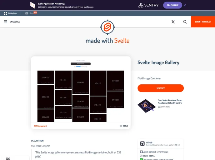
A Masonry-Like Image Container for Svelte
svelte-image-gallery is a Masonry-Like Image Container designed specifically for the Svelte framework. It provides a responsive image gallery out of the box and allows customization through various parameters.
gap parameter.maxColumnWidth parameter can be used to set the maximum width for each column in the gallery.hover parameter to true, users can enable image enlargement when hovering over them.loading parameter, which supports different loading types.To install svelte-image-gallery, you can follow these steps:
npm i to install dependencies.npm run dev to start the development server.svelte-image-gallery is a versatile component for creating Masonry-Like image containers in Svelte. It offers responsiveness out of the box, customizable parameters, and easy installation. With this component, users can quickly create dynamic and visually appealing image galleries for their Svelte applications.