Svelte 5 component library
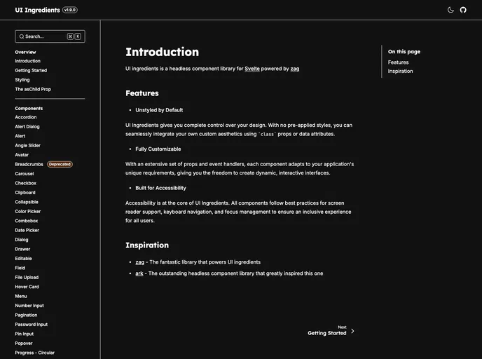
The transition to newer technologies and libraries is a common occurrence in the ever-evolving landscape of software development. With the upcoming deprecation of the UI Ingredients library, it’s essential to explore the recommended alternative, the @ark-ui/svelte package. This headless UI library simplifies the development of reusable and scalable design systems, catering to a variety of JavaScript frameworks, making it a versatile tool for developers aiming to streamline their workflows.
The Ark UI library boasts a rich collection of over 45 components designed to promote efficiency and consistency in user interface design. With a focus on Svelte, it encourages best practices and seamless integration into projects, which is particularly appealing for developers seeking robust solutions for their design needs.
Headless Component Library: Ark UI provides a collection of unstyled components, allowing for complete customization and flexibility in design to fit your project’s branding.
Large Component Set: Over 45 components are included, covering a wide range of UI elements to expedite the development process while ensuring consistency.
Designed for Svelte: Specifically crafted for the Svelte framework, ensuring that components leverage Svelte’s reactive programming model for optimal performance.
Tailwind CSS Integration: The library includes a dedicated Tailwind plugin that allows for easy styling of components with just data attributes, simplifying the design process.
Active Community and Documentation: Access extensive documentation and community support for guidance on implementation and best practices.
Future-Proofing Projects: By transitioning to @ark-ui/svelte, developers can adopt a modern, actively maintained solution that aligns with current practices and updates.