Theme switcher for Svelte & TailwindCSS
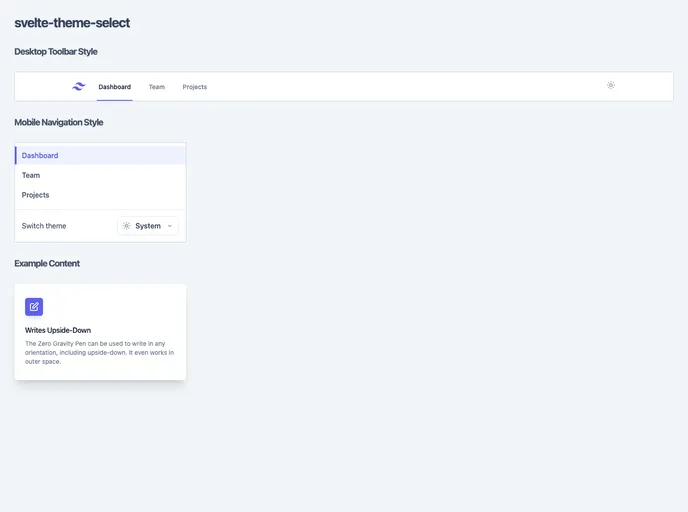
The Svelte Theme Select is a customizable set of Svelte components that allow users to select and apply themes, such as light mode or dark mode, in their SvelteKit projects. Inspired by the theme select option on the TailwindCSS website, these components provide a user-friendly and visually appealing way to switch between different themes. The project also includes the functionality to persist and apply the selected theme within the SvelteKit project.
To use the Svelte Theme Select in your SvelteKit project, follow these steps:
npm install svelte-theme-select
+layout.svelte file:<script>
import { Theme, ThemeToggle, ThemeSelect } from 'svelte-theme-select';
</script>
<Theme>
<ThemeToggle />
<ThemeSelect />
</Theme>
src/app.html app shell. This enables the use of TailwindCSS classes including the dark: prefix for when dark mode is active.<!DOCTYPE html>
<html lang="en">
<head>
<!-- ... -->
<style>
/* Set light and dark mode backgrounds */
:root {
--tw-light-bg-color: #ffffff;
--tw-dark-bg-color: #000000;
}
</style>
<!-- ... -->
</head>
<body>
<!-- ... -->
</body>
</html>
With these steps, the Svelte Theme Select will be installed and ready to use in your SvelteKit project.
The Svelte Theme Select is a collection of customizable Svelte components that allow users to easily switch between different themes in their SvelteKit projects. Inspired by the theme select option on the TailwindCSS website, these components provide a visually appealing and user-friendly way to toggle between light mode and dark mode. With the ability to customize the UI widgets and replace icons and labels, the Svelte Theme Select can be seamlessly integrated into any TailwindCSS project.