A colour picker component for Svelte
The Svelte Colour Picker is an intuitive and user-friendly tool designed to enhance color selection in web applications. Built on the Svelte framework, this component allows developers to implement a sleek and responsive color picker without the overhead of heavy libraries. Whether you are designing a web app or working on a creative project, this component makes it easier to integrate a powerful color selection interface seamlessly.
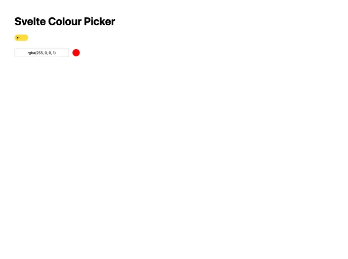
With its modern design and ease of use, the Svelte Colour Picker provides a smooth experience for users. It allows for precise color selection, making it a valuable addition to any designer’s toolkit. Let’s explore some of its standout features.
User-Friendly Interface: The color picker boasts a clean and intuitive layout that simplifies the selection process for users of all skill levels.
Responsive Design: It adapts beautifully to different screen sizes, ensuring that it works well on both desktop and mobile devices.
Customizable Colors: Developers can easily customize default colors to match their branding or user requirements, providing a tailored experience.
Real-Time Color Preview: Users can see the selected color in real-time, allowing for immediate feedback and adjustments.
Support for HEX, RGB, and HSL: The component supports multiple color formats, making it versatile for various design needs.
Lightweight Component: With a small footprint, this color picker does not add significant load time to your application.
Easy Installation: The component can be quickly integrated into any Svelte project with minimal setup, allowing for fast and efficient development.