Rate component for Svelte
The Svelte Rate ItRate component is an elegant and flexible tool for integrating a star rating feature into Svelte applications. Inspired by the popular vue-rate, this component brings an easy-to-use interface for users to give feedback on products or services seamlessly. Whether you’re building an app, a website, or a specific project, the Svelte Rate ItRate component provides a functional and aesthetic addition that enhances user interactions.
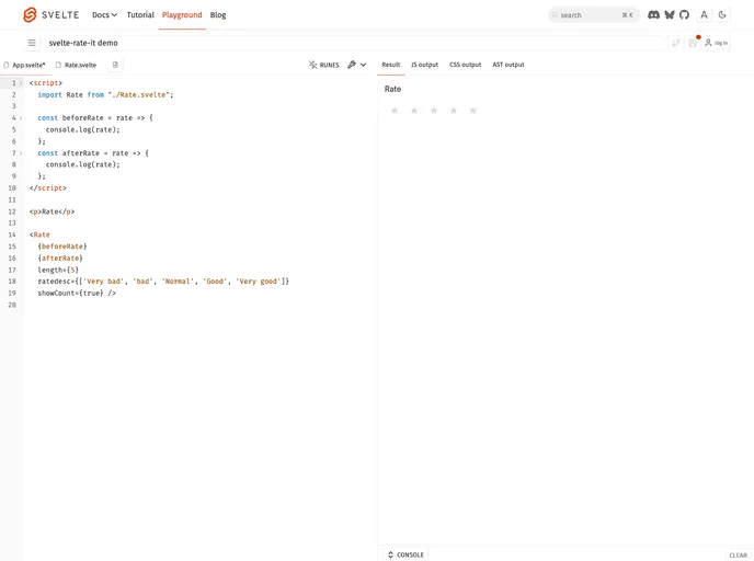
With simple installation and intuitive usage, the component is designed to cater to various needs and preferences. It allows developers to customize ratings effectively, making it an excellent choice for those looking to implement a rating system quickly.
length {number} property to meet your design requirements.value {number} option to pre-fill the rating when users first engage.showCount {boolean} feature to display the number of ratings when the user hovers over a star.ratedesc {object} option to provide an array of descriptions for each rating star, enhancing user understanding.disabled {boolean} option, or set it to read-only with readonly {boolean} for cases where input is not needed.