Svelteit is a minimalistic UI/UX component framework for Svelte and Sapper projects
Svelteit is a minimalistic UI/UX component library designed specifically for Svelte and Sapper projects. It offers a range of customizable components that can enhance the user interface and experience of Svelte applications.
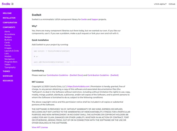
To install Svelteit, follow these steps:
Open your terminal and navigate to your project directory.
Run the following command to install Svelteit as a dependency:
npm install svelteit
Once the installation is complete, you can import the desired components from the library into your Svelte or Sapper project.
import { Button, Card, Input } from 'svelteit';
You can now use the imported components in your Svelte templates.
<script>
  import { Button } from 'svelteit';
</script>

<Button>Click me</Button>
Svelteit is a minimalistic UI/UX component library specifically designed for Svelte and Sapper projects. It offers a range of customizable components that can enhance the user interface and experience of Svelte applications. With easy integration and a minimalistic design approach, Svelteit provides developers with the tools to create sleek and modern applications.