Overview
Svelte CSS media queries provide a powerful yet lightweight solution for managing responsive designs directly within Svelte applications. With the integration of TypeScript support, this package makes it easier than ever to create responsive components that adapt to various screen sizes and orientations. Whether you’re a seasoned Svelte developer or just starting, you’ll find the ease and comfort of using this package enhances your development experience.
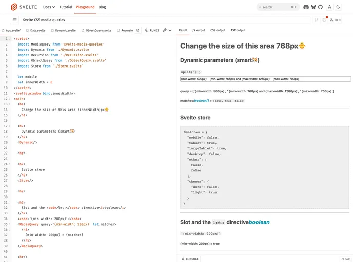
This tool leverages the reactive nature of Svelte, allowing for intuitive handling of media queries that automatically adjust as conditions change, ensuring that your designs remain elegant and user-friendly across all devices.
Features
- Lightweight: Minimal footprint ensures that your application remains fast and responsive without unnecessary bloat.
- TypeScript Support: Fully compatible with TypeScript, providing strong typing benefits for cleaner and more maintainable code.
- Reactive Design: Leveraging Svelte’s reactivity, updates to media queries happen automatically without requiring manual intervention.
- Intuitive Usage: Similar to standard CSS media queries, making it easy to integrate for those familiar with CSS.
- Slot & Bind Directives: Built-in directives for handling different states and adapting components seamlessly based on media conditions.
- Array Indexing: Allows for advanced querying capabilities through array indices, adding flexibility in managing media queries.
- Compact Documentation: Clear examples and documentation provided for quick reference and easy implementation.