Overview
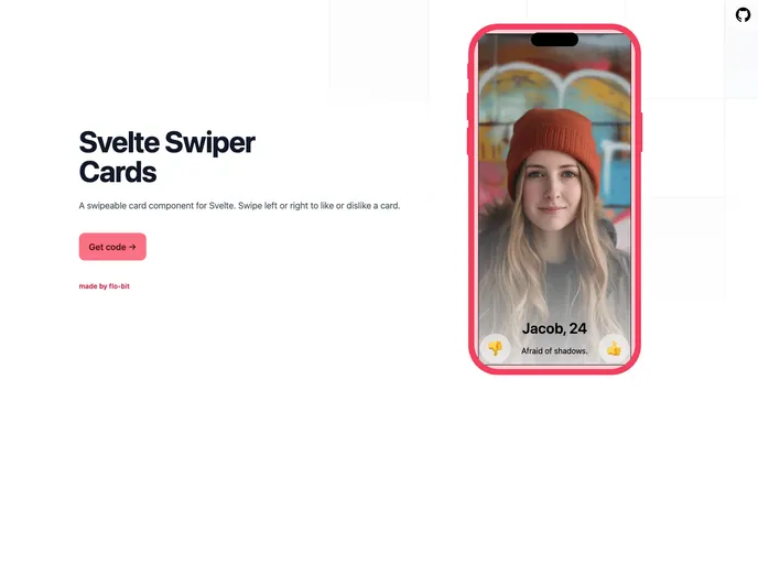
The svelte-swiper-cards is a dynamic and engaging component designed for Svelte, inspired by the popular Tinder swipe interface. It allows developers to integrate swipeable cards into their applications effortlessly, creating an interactive user experience. Built primarily with Tailwind CSS, this component not only looks modern but offers extensive customization options to meet various design needs.
Whether you’re building a dating app or a product showcase, svelte-swiper-cards leverages the powerful @use-gesture/vanilla library for handling gestures seamlessly. With its TypeScript foundation, it ensures type safety and maintainability, making it a perfect choice for developers looking to enhance their projects with swipeable functionalities.
Features
- Built with Tailwind: Utilizes Tailwind CSS for styling, allowing for easy integration and customization of the UI.
- Reusable Cards: Features a unique design that swaps only two cards, optimizing performance and maintaining a fluid experience.
- Customizable UI: Easily modify the appearance and data of the cards by customizing the Card.svelte file and adjusting the CardData type.
- Gesture Handling: Implements @use-gesture/vanilla for smooth and modern gesture recognition, creating an intuitive swiping experience.
- TypeScript Support: Built with TypeScript for enhanced type safety and better developer experience.
- Programmatic Control: Offers the ability to control card actions programmatically, enhancing interactive capabilities within your app.
- Threshold Indicators: Allows the use of a threshold overlay during swiping, with customizable parameters for swipe distance and velocity.
- Keyboard Navigation: Supports swiping with arrow keys by default, providing an alternative navigation method for users.