Svelte components
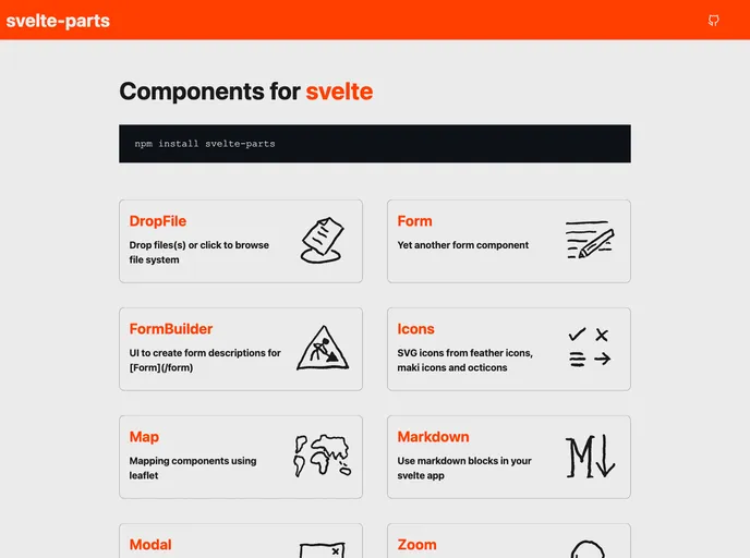
The svelte-partsdocs is a collection of components for Svelte, a JavaScript framework for building user interfaces. It provides various components such as DropFile, Form, FormBuilder, Icons, Map, Markdown, Modal, and Zoom. Recently, the svelte-partsdocs have been updated to incorporate svelte-kit for packaging the components and fixing TypeScript errors in Svelte@3. The components are now available under a single npm library called svelte-parts.
To install and use the svelte-partsdocs components, you can follow these steps:
Make sure you have Node.js and npm installed on your machine.
Open your terminal and navigate to your desired project directory.
Run the following command to install the svelte-parts library:
npm install svelte-parts
Import the desired components in your Svelte project using import statements, for example:
import { DropFile, Form, FormBuilder } from 'svelte-parts';
Start using the components in your Svelte application.
The svelte-partsdocs provide a wide range of components for Svelte applications. With features such as drop file upload, form building, SVG icons, mapping, markdown support, modals, and zooming on images, these components enhance the development experience and add valuable functionality to web applications. The recent update to use svelte-kit and consolidate the components under a single npm library demonstrates the commitment to improving the usability and maintainability of the svelte-partsdocs. However, it is worth noting that the @svelte-parts/editor component has not been ported to svelte-parts and is still using an older version of CodeMirror.