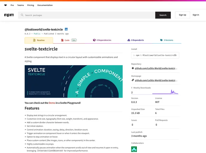
A Svelte component that displays text in a circular layout with customizable animations and styling.
Overview
The Svelte TextCircle component brings a fresh and dynamic way to display text in a circular format, perfect for eye-catching designs. With its customizable features, you have the freedom to tailor each element to fit the aesthetic of your project. Whether you’re creating an engaging website or a simple presentation, this tool can elevate your text presentation with style and flair.
What sets TextCircle apart is its focus on animation and interactivity. The component not only displays text creatively but also animates it in a way that captures attention, creating an engaging user experience. With options to adjust everything from the size of the circle to the speed and direction of the animations, it’s a versatile choice for developers seeking to enhance their design.
Features
- Custom Circular Layout: Display text strings arranged in a circular format, offering a unique presentation style.
- Flexible Customization: Adjust circle size, font styling (size, weight, transform), and overall appearance to match your design needs.
- Dividers Between Words: Use a custom character (like a diamond) as a divider between words for added visual interest.
- Animation Control: Set animation properties such as duration, easing, delay, direction, and iteration count for a tailored animation experience.
- Interactive Triggers: Animate text on hover or when the component enters the viewport for an engaging user interaction.
- Performance Optimization: Automatically pauses animations when the component scrolls out of view and resumes when it re-enters, enhancing performance.
- Central Content Placement: Lightly place custom content like images or icons at the center of the circle for a personalized touch.
- Built with Svelte 5: Designed specifically for Svelte 5, utilizing runes for efficient rendering and performance.